A product with potential — and a brand holding it back.
AllAccess had a strong functional core — event discovery, ticketing, and management all in one place. But the visual identity and UX were inconsistent, dated, and failing to communicate the premium experience the platform was capable of delivering.
The rebrand challenge was twofold: modernize the visual identity in a way that would resonate with event organizers and attendees alike, while simultaneously streamlining the user experience to reduce friction in the path from discovery to ticket in hand.
Where the brand becomes the experience.
Events are emotional experiences — anticipation, excitement, community. The brand needed to carry that energy while the UX needed to get out of the way. A bold visual identity that commands attention at the marketing level, paired with a UI that disappears into the experience of the event itself.
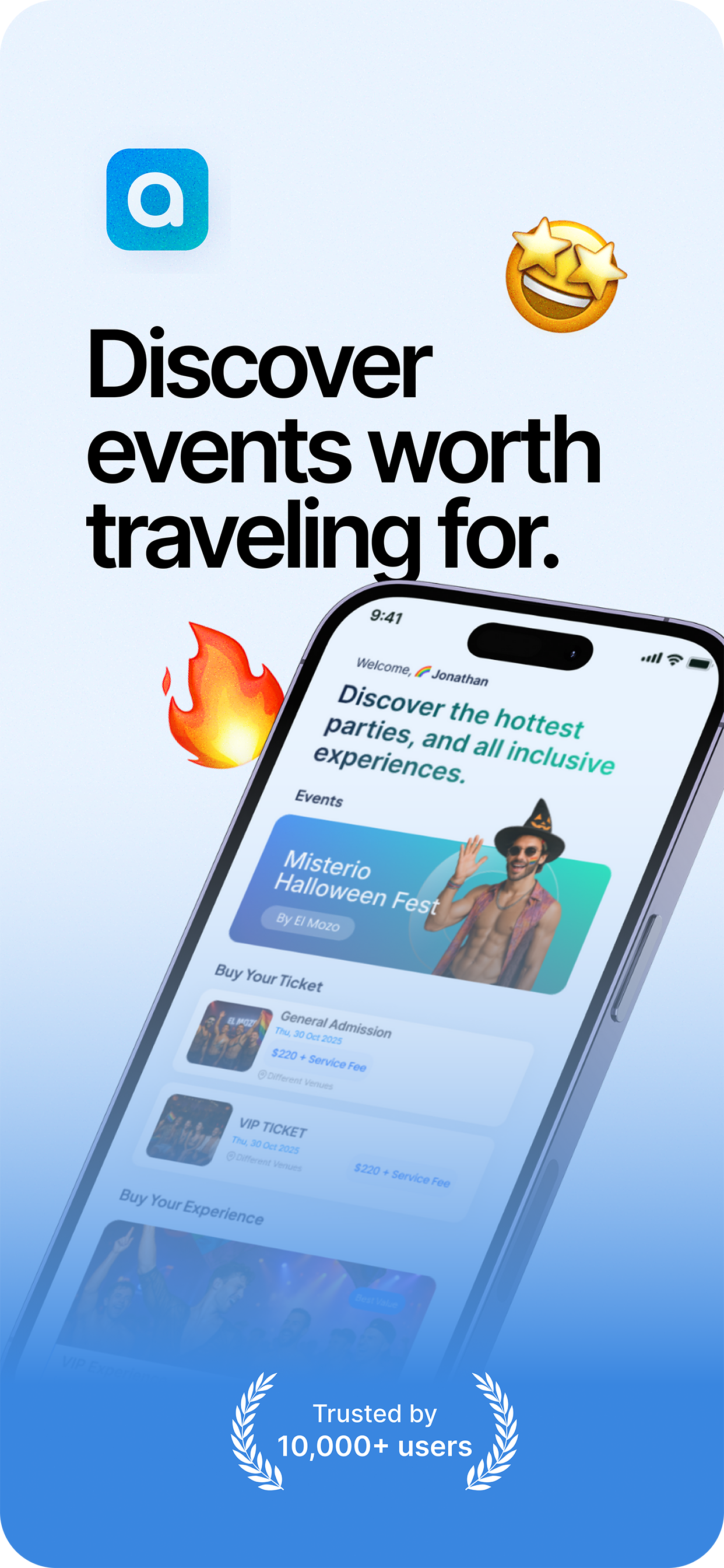
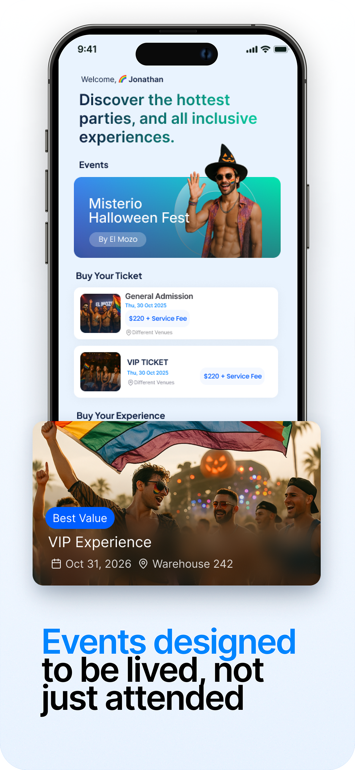
The north star: an app that makes buying a ticket feel as exciting as attending the event.
From generic to unforgettable.
Every pixel with purpose.
Brand Audit & Positioning
Competitive landscape analysis of 8 event platforms, user sentiment research on current brand perception, and brand positioning workshop to define the territory AllAccess should own.
Identity System
Logo redesign, color system, typography selection, and iconography guidelines — all designed with mobile-first execution in mind and App Store presentation requirements in view.
UX Redesign
Complete information architecture restructure, conversion funnel optimization for the ticketing flow, and high-fidelity UI design across all primary user journeys from onboarding to post-event.
The experience, screen by screen.
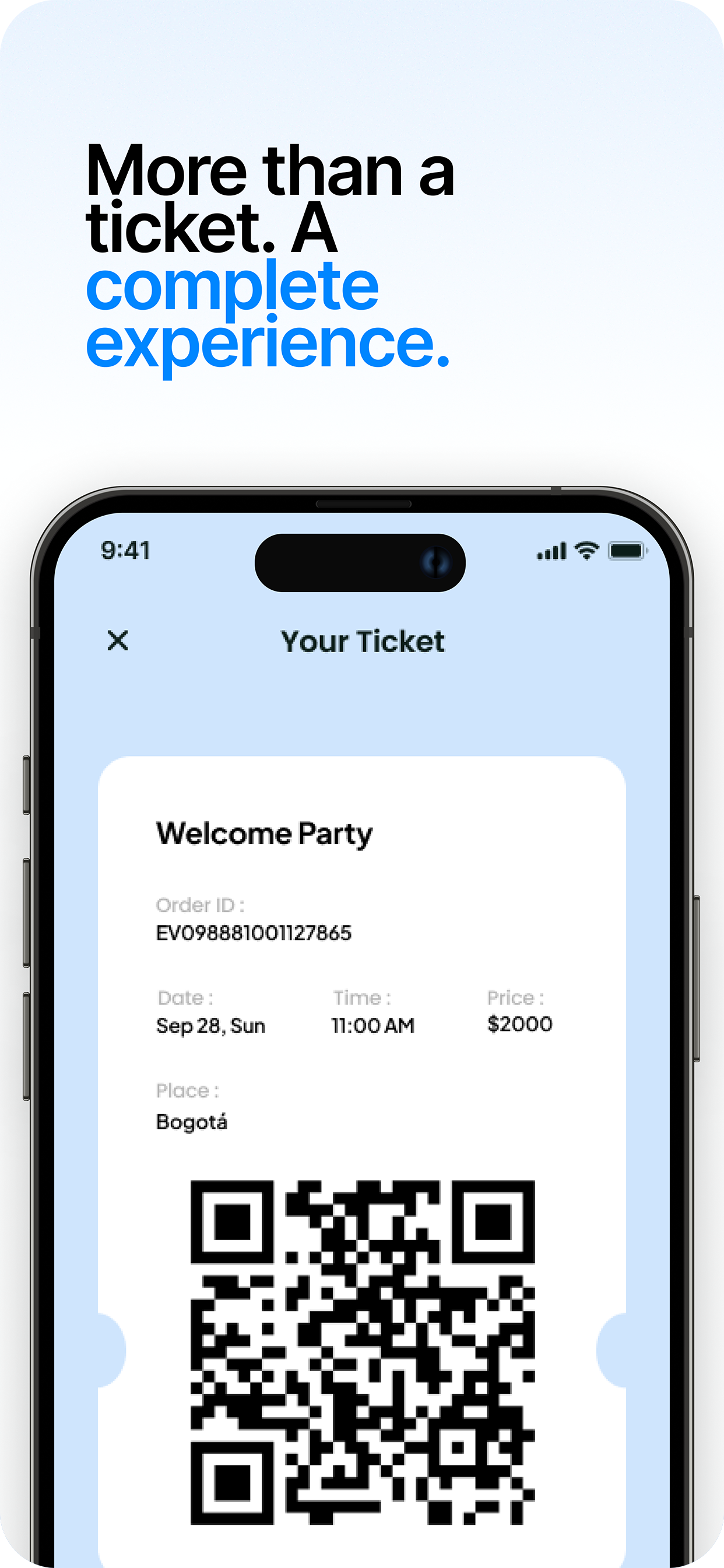
Every screen was designed to carry the brand forward while making the user's next action obvious. Dark theme for premium feel, vibrant event imagery for emotional engagement, and a ticketing flow reduced to its essential steps.
A brand that opens doors.
AllAccess emerged from the rebrand with a cohesive, premium identity and a UX that reduces drop-off at every step of the ticketing funnel. The visual system scales from app icon to event marketing — everywhere the brand shows up, it commands attention and communicates quality.