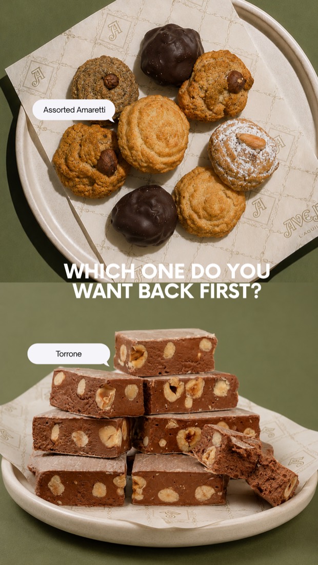
PollWhich one do you want back first? — demand data before a single pallet moved.
I rebuilt the brand's entire digital presence for the U.S. market: a new social strategy and look and feel, an AI-powered content engine, a paid media program with creatives hitting 7.61% CTR, and a landing page that replaced a site scoring 40 on SEO and 60 on accessibility.
Social Media Strategist · Creative Director · Paid Media
Instagram · Facebook · TikTok · Meta Ads · Email
Meta Ads Manager · Shopify · Klaviyo · ElevenLabs · Higgsfield · Figma
Strategy · Look & Feel · Landing Page · Reels · UGC · Ad Creatives
Dolci Aveja has been making traditional Italian sweets in L'Aquila since 1977. Amaretti, ferratelle, tozzetti, torrone — recipes that haven't changed in three generations. The product was never the problem.
The problem was everything that happened before somebody tasted it. The brand was entering the U.S. market, where nobody knows what a ferratella is and where "Italian cookies" is a shelf crowded with mass-market imitations. The existing site was slow, hard to read for anyone using assistive tech, and effectively invisible to search — it scored 60 on accessibility and 40 on SEO. The social channels looked like a product catalogue: nice photos, no story, no reason to follow, no reason to buy.
So the work wasn't "post more." It was to rebuild the whole path a person walks from first scroll to first order — and to do it fast enough, and cheap enough, for a family business that doesn't have a studio on retainer.
The channels didn't look like a heritage Italian brand. They looked like a store. Nothing on the grid signalled L'Aquila, 1977, or artisanal.
Poor accessibility, weak SEO, and a slow, generic purchase flow. Paid traffic was landing somewhere that couldn't convert it.
Product photography was limited to flat packshots. There was no lifestyle imagery, no video, and no budget for a full production cycle.
American buyers who had never heard of the brand and needed to be taught the difference — not just shown a product.
The first strategic decision was to stop treating Instagram, Facebook and TikTok as one channel with three copies of the same post. Dolci Aveja's audience doesn't behave the same way in all three places — the buyer on Facebook is older, more careful, and needs proof; the audience on Instagram buys with their eyes; TikTok has its own language entirely and punishes anything that sounds like an ad.
So I defined a clear role for each channel, and wrote content briefs against those roles rather than against a posting calendar.
Visual desire and sensorial storytelling. Product, texture, light, lifestyle. This is where the brand looks like something you want on your table — and where the L'Aquila origin becomes a mood rather than a paragraph.
Confidence, community and social proof for the 45+ audience — the segment that actually buys gift boxes. Longer captions, real reviews, links, and education about ingredients and provenance.
Worked separately, on purpose. The rhythm, the language and the audience are different. I never forced Instagram and Facebook to sound like TikTok — or the reverse. Native format, native pacing, native hooks.
L'Aquila, the family, 1977. The reason these recipes taste different from anything on a U.S. supermarket shelf.
Ingredients as proof: 44% Italian hazelnuts, no preservatives, no industrial process. Specificity is what builds belief.
La merenda. The end of the day. Coffee at 4pm. Selling a moment Americans don't have a word for yet.
Reviews, UGC, and gift bundles — the content that carries the heaviest weight at the bottom of the funnel.
The packaging was already beautiful — deep green, cream, gold filigree, a wax seal dated 1977. None of that had made it onto the feed. So I built the digital look and feel directly out of the physical brand instead of inventing a new one.
Palette. Aveja green and cream as the base, gold as the accent, warm terracotta and stone as the photographic environment. Every asset had to look like it belonged in the same room as the box.
Typography & layout. An editorial serif for headlines with a clean sans for detail — heritage without nostalgia. Grid posts alternate product, people and place so the profile reads as a story from the first screen.
Photography direction. Warm light, real surfaces, hands in frame. No white-background e-commerce shots on social — those live on the product page, not the feed.
The result is a profile where somebody can land on the grid, scroll three rows, and understand exactly what the brand is before reading a single caption.
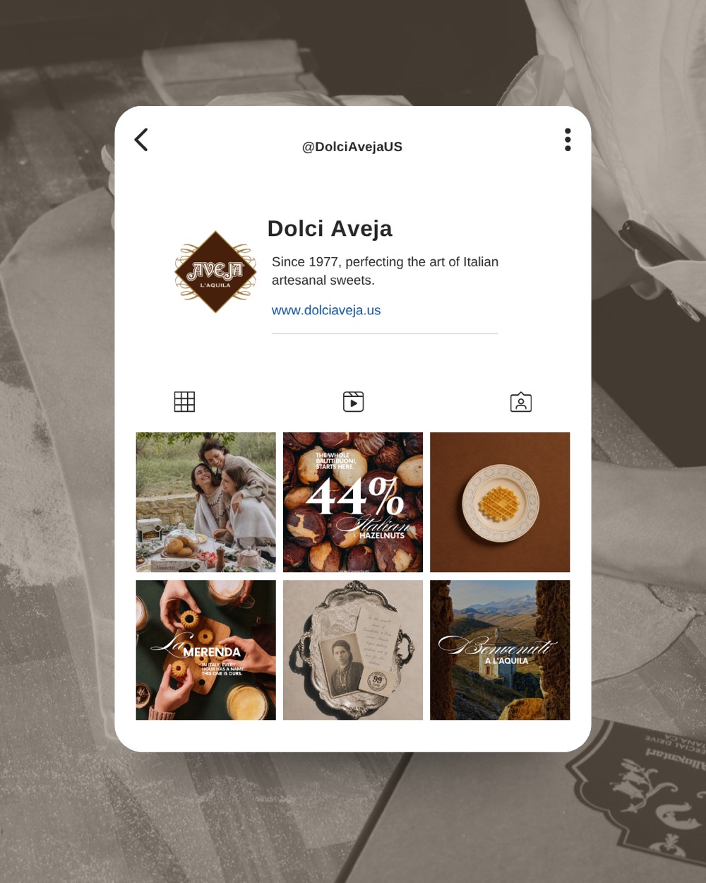
The rebuilt @DolciAvejaUS grid — product, family, ingredient proof and L'Aquila landscape alternating in a fixed rhythm.
Before spending another dollar on traffic, I audited where that traffic was going. The existing site scored 40 on SEO and 60 on accessibility — with performance and best practices not far behind. Slow loads, missing semantics, poor contrast, unlabelled elements, no structured data. In practice: Google couldn't read it, screen readers couldn't use it, and mobile buyers left before it painted.
So I built a dedicated pre-order landing page from scratch, designed around one job — turn a cold visitor from a Reel into a pre-order — and engineered so the technical fundamentals were correct by default.
Real heading hierarchy, labelled controls, alt text on every product image, AA contrast throughout, and keyboard-navigable flows. Accessibility stopped being a score and became the reason the page reads well on a phone in bright sun.
Descriptive titles and meta, structured product data, clean URLs, compressed and correctly sized imagery, and copy written around what people actually search for — "Italian amaretti", "authentic Italian cookies", "Italian gift box".
Hero promise → bestsellers → why it's different → social proof → bundles → gifting → reviews → FAQ. One argument, in order, with a pre-order CTA repeated at every decision point.
UTM-tagged, pixel and event tracking verified end to end, and message-matched to the ad creative — so somebody who clicks a UGC Reel lands on the exact promise that Reel made.


Dolci Aveja had a hard constraint: the U.S. warehouse was between shipments, and the restock landed on July 1st. Instead of hiding that, I made it the entire mechanic. The campaign ran as a pre-order window — scarcity that was genuinely true — with each phase moving the audience one step closer to a decision.
I built the full stack behind it in a single sprint: Shopify pre-order flow, the landing page, Klaviyo automations, ad creatives, tracking and UTMs. Then the campaign went live and phased its message week by week — emotional first, product second, social proof third, and a soft reminder before the restock.
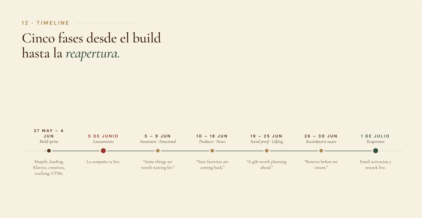
The campaign calendar: build sprint → launch → awareness → product desire → social proof and gifting → soft reminder → restock.
This is the ad set that mattered. Four creatives — three AI-produced UGC Reels and one social-proof cut — running to a cold American audience that had never heard of the brand.
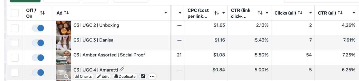
CTR is the cleanest read you get on whether a creative is actually landing. It happens before the site, before the price, before the offer — it's purely a measure of whether the thumb stopped and the person wanted more. The average e-commerce advertiser on Meta sits around 1.5% CTR (all) and roughly 1% link CTR. These creatives ran at four to five times that, on cold traffic, for a brand with no U.S. recognition.
The second thing that number does is buy media cheaper. Meta rewards creatives that earn attention with lower auction costs — which is exactly what shows up in the CPC column: $0.84 to $1.16 per link click on the top three creatives, in a U.S. food-gifting market where $2–3 is normal. Better creative didn't just perform better; it made every remaining dollar go further.
And the pattern inside the data is the real lesson: the three highest performers were all UGC — a person, a kitchen, a real reaction. The lowest performer was the most polished unboxing. On a cold audience, credibility beat production value every time. That finding is what drove the entire content pipeline below.
Dolci Aveja had no lifestyle photography and no budget for a shoot in Italy. What they did have was a single studio packshot per SKU — a box on a white background. That was the input.
I built a repeatable image pipeline around it: lock the product and the brand's visual rules as fixed references, then generate scene after scene against those constraints. The packaging never changes — the seal, the green panel, the gold filigree, the type on the box stay pixel-faithful. Only the world around it does.
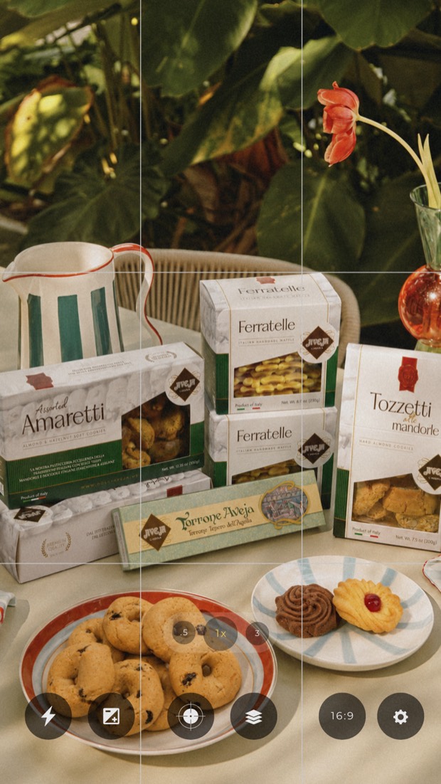
The discipline is the whole trick. Without a locked reference you get "Italian-looking" images that quietly drift off-brand. With it, I could produce a full seasonal library — trattoria, tiled kitchen, garden lunch, café table, morning linens — in an afternoon, all shot on the same "camera", all usable as paid creative.
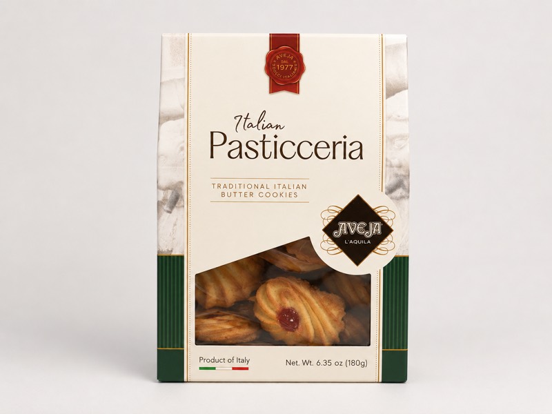
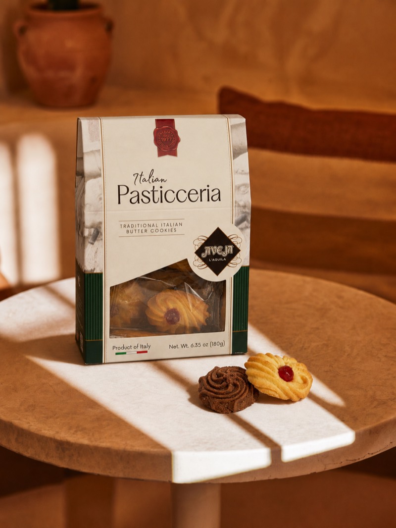
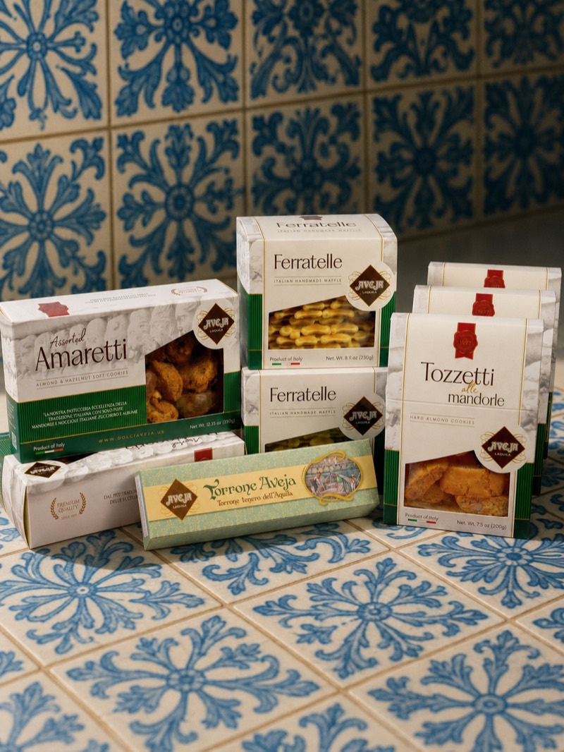
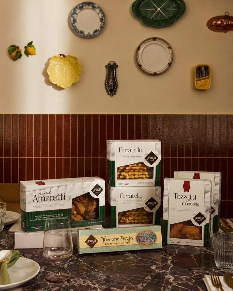
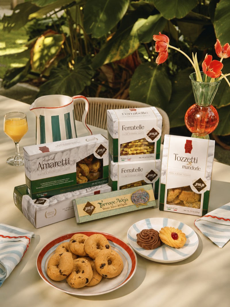
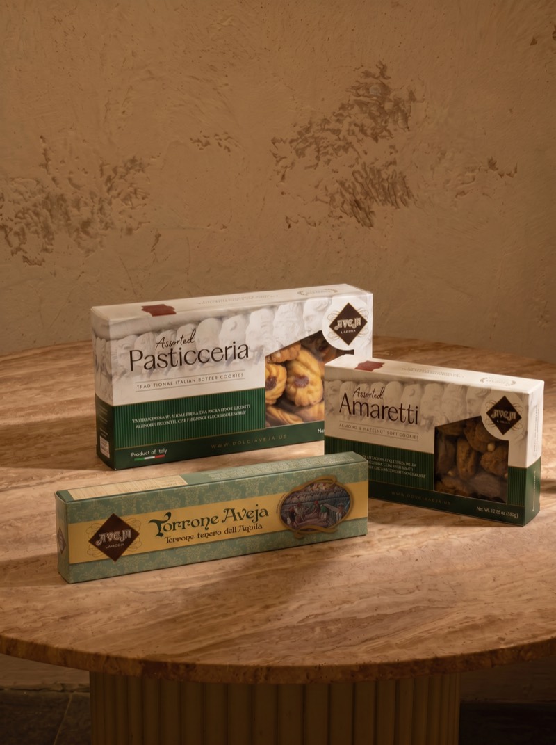
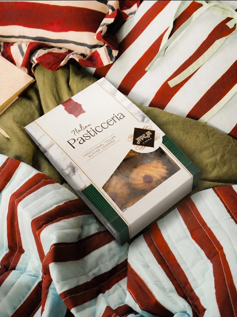
Every scene above started from the same white-background packshot on the left. The brand lock is what keeps them a family rather than six unrelated images.
The ad data said it plainly: a person talking to camera in a real kitchen beat every polished asset we ran. But Dolci Aveja is an Italian family business launching in the U.S. — there was no roster of American creators, no shipping window to send product for filming, and no time to run a casting round before the July restock.
So I built the creators. Each UGC Reel below is produced end to end through a five-step pipeline that I run like a small production house — script, voice, talent, film, post. The point isn't that AI made it; the point is that the process is repeatable, so testing a new hook costs hours instead of weeks.
Every reel starts as writing, not as a prompt. I write in the buyer's voice, not the brand's — one insight per script, the hook landing inside the first second and a half, and a single claim carried through to a CTA that matches the funnel stage. "Italian sweets in the U.S. don't taste like Italy" is a script decision, and it's the reason that creative won.
The voice is produced before anything visual, because the audio is what sets the timing of the whole edit. I cast a voice that matches the persona — age, warmth, regional read — then tune stability and similarity until the delivery has real speech rhythm: pauses in the right places, emphasis on the claim, no announcer cadence. The rendered VO becomes the spine every later step is cut against.
I build a consistent creator identity — face, age, styling, and the kitchen she stands in — and keep it locked across the campaign. Consistency matters more than realism here: when the same "person" appears across several reels, the audience reads her as a returning creator rather than a stock face, and retargeting sequences hold together.
The VO drives the performance: lip-sync, gesture, and eye-line generated shot by shot with deliberate camera direction — handheld framing, natural head movement, the product entering frame the way somebody actually picks it up. Shots are generated in short takes rather than one long clip so I can recut and reorder in the edit.
Post is where it stops looking generated. I cut to the VO, intercut real product footage and the generated scenes from the image pipeline, then add burned-in subtitles styled in the brand's editorial serif — because most of this is watched muted. Sound design, room tone, a soft grade toward the Aveja palette, and safe-area checks for Reels, TikTok and Stories before exporting a version per placement.
Every finished reel goes into the ad account as a named creative variant — C3 | UGC 3 | Danisa — so performance is attributable at the hook level, not just the campaign level. Winners get scaled and re-cut into new hooks; losers get killed in 72 hours. The pipeline exists to make that loop cheap.
Tap any reel to play with sound. All six were produced through the pipeline above and shipped as named creative variants inside the ad account.
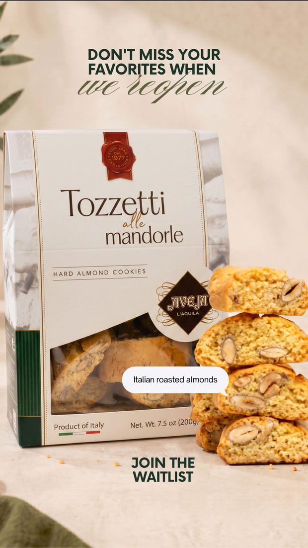
During the pre-order window the feed carried the argument and Stories carried the conversation. I used them to build the waitlist, to run polls that told me which SKU to restock first, and to keep a daily reason to be at the top of the tray without burning the grid.
Every story carried a native sticker with a job to do. The poll told me which SKU to restock first. The question box surfaced the objections I hadn't written copy for yet. The countdown collected notify-me sign-ups automatically, so the reopening had an audience waiting for it instead of an announcement shouted into an empty room.
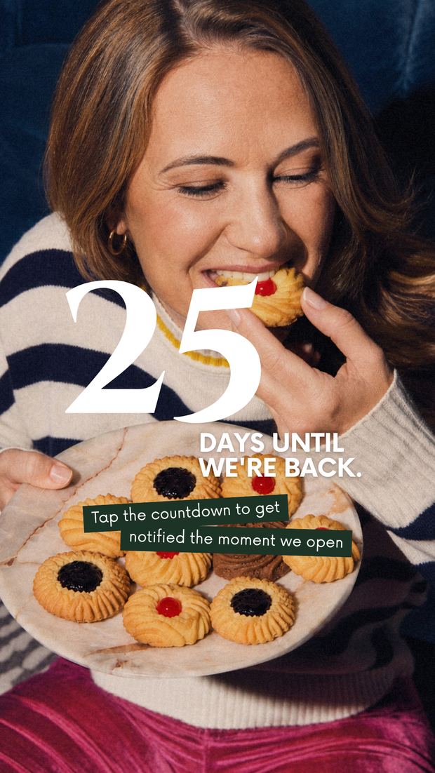
The three UGC creatives beat the studio-grade unboxing on every metric. On cold traffic, people are buying whether they believe you — not whether you look expensive.
A 40 SEO score and a 60 accessibility score aren't audit trivia — they're the difference between paid traffic that converts and paid traffic that bounces.
The value wasn't generating an image. It was locking the brand hard enough that generation became repeatable — and cheap enough that testing a new hook stopped being a budget decision.
The moment Instagram, Facebook and TikTok stopped sharing one calendar and started serving desire, trust and discovery separately, everything downstream got easier to write.
"Dolci Aveja is not mass-market candy or generic cookies with an Italian label. My job was to make one scroll on a phone in Ohio feel like a Tuesday afternoon in L'Aquila."The idea behind every decision in this project